With easy access to tools like Canva and Adobe Suite, posting graphics to social media is an easy way to communicate with our communities. However, ensuring the graphics are accessible can be a bit more challenging. It is imperative to think through graphic accessibility because the steps to ensure a graphic is an accessible start with the creation of the image.
What to consider when creating graphics:
- Always include alt text and image descriptions for any post graphics.
- If alt text and image description functions are unavailable, consider turning the graphic into a video and adding a voice-over.
- Use text for impact, like to grab your viewer's attention. Avoid posting graphics that are text-heavy and convey critical information.
- If you have a lot of information to include in your graphic, consider turning it into a video or adding more slides that allow for multiple graphics to be posted at once.
- Review your graphics on your smallest devices to ensure readability before posting.
- Maintain a color contrast of at least 4.5:1. Review our color combination guidelines.
- Do not rely on color to convey meaning.
- For animated video graphics, ensure they are on screen for an appropriate length.
Graphic examples:
Good graphic example:
Bad graphic example:

Why this is accessible:
- Color contrast of all elements is more than 4.5:1
- Minimal text large text
- Text is used to grab your attention
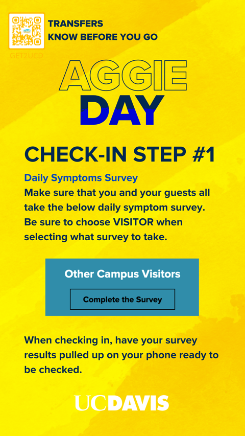
Why this is inaccessible:
- Logo and QR contrast with the background is less than 4.5:1
- Too much text and information to consume in the 15 seconds allotted for an Instagram Story
- Colors are used to differentiate titles
- Text is very small once viewed on a phone screen
Graphic resources
- Acceptable UC Davis color combinations
- UC Davis website color accessibility guidelines
- Adobe color contrast analyzer
- Canva best practices