User Experience for Web
Follow these best practices to improve the usability of the websites you manage. We recommend user-centered design in all of your digital design projects. Cater everything you create for digital display to the users of that display, whether that be a website frequented by current students, or an interactive kiosk used by visitors. Each project should be designed to meet the needs of your users. It all begins with identifying who your users actually are.
Know your audience and their needs

- Use analytics and other research to determine your primary audience. If you have a new project use competitor websites to identify your audience.
- Find out your audience needs and design your digital experience to respond to them. If your website's primary audience are current students seeking a Picnic Day schedule of events, don't dedicate the homepage to display a detailed history of Picnic Day, give them the schedule right away.
- Don’t assume your users know your unit’s internal structures and terminology. Use lay terms or briefly define your industry jargon. Acronyms are the best example of this, you may know them, but most people don't.
- With your page layouts, focus the user’s attention on what is important to them.
- Tell users what is unique and important about your unit, but do so without getting in their way.
- Build empathy for your users. Immerse yourself with data, imagine yourself in their position and talk to your audience. Focus your site on what is most important to them. How would you feel in this moment on your website as them? What would you want to know? What would you want to see on the site? Would you find this information helpful or interesting? One big caveat: you are usually not a member of your audience, hone your intuition with user research.
Write in plain language

- Plain language is accessible to everyone, including those readers with cognitive disabilities and low literacy.
- Use simple words and phrases.
- Keep it concise and as short as possible.
- Make your writing conversational.
- WCAG guidelines ask that we use plain language online.
- Check the readability of your copy using an editor such as Hemingway App.
- Find more plain language guidelines at plainlanguage.gov.
Simplify your navigation

Your audience shouldn’t have to figure out how to find what they’re looking for. Make it easy for them to succeed. Follow the “Rule of Seven”:
- Keep navigation simple and concise.
- Keep main navigation items to seven or less. In most cases, navigation items can be limited to five or less.
- Keep drop-down menus to seven items or less.
- Avoid large navigation sets to avoid cognitive overload (which leads to indecision).
- Establish a logical information hierarchy by grouping similar content for easy consumption.
- Use intuitive language that informs the user journey when they click on a navigation item.
- Do not link to external websites from your main navigation.
Design BIG and SIMPLE
Keep your design clean and easy to explore. When possible use large images, icons and limited text to get your users through your experience. White space is your friend. When text and other design elements are too densely packed, they become invisible to users. Keep multiline descriptive text to informational pages. Your homepage should usually have only an intro paragraph.
- Use images and simple graphics with ample white space and limited text on landing pages.
- Use icons and colors to help your audience through the experience.
- Don't jam too much information on one page. A user is more likely to absorb the information they need through a carefully constructed user journey (several clear and concise pages strung together) than a page brimming with text and buttons. Aim to make Google, not Craigslist.
- Keep your pages to one sidebar maximum. Double sidebar pages are the most difficult pages to navigate for modern users and unusable on mobile devices.
- Don't put obstacles in the way of your users. If you have information that is a great concern to your stakeholders, but not necessarily your users (i.e. promotions, administrative highlights, news), by all means present it on your site, but do not place it in the middle of a user journey.
- Make important things BIG. Don't waste large areas of the page for unimportant information. If you make something big, it should directly address a primary user need.
Use your heroes wisely

What is a hero? A hero is a large image or video placed at the top of the page that contains a title and call to action for your audience. Often these are used for content like news, marketing or other non-essential user content. Heroes should be used for the primary task users are seeking on that page. If you have discovered the primary audience behavior on your site is users seeking the schedule of events for Picnic Day, that schedule should be in your hero, not an article about the history of Picnic Day. These are powerful expanses of web real estate, so use them to their potential. If you have nothing important to present as a call to action, do not have a hero on that page.
Make metrics-based decisions

Your web metrics do more than just tell you how your website is performing. Analyzing these metrics provide significant insights into the behavior of your audience. What content resonates with them? What are they more likely to read versus something else? Questions like these can often be answered with simple metric analysis. Learning how to interpret these metrics can be the difference between a successful and optimized website and one that is not.
Aim for clarity and consistency
- Be consistent, clear and concise. This applies to every aspect of your site.
- Your writing should be clear, free of jargon and no longer than it has to be. Provide more detail “on demand,” if necessary, through separate pages.
- Be consistent across your site in terminology, labels, layout and positioning, style and navigation.
- All images should add to the user’s experience. Avoid visual clutter.
Create responsive websites
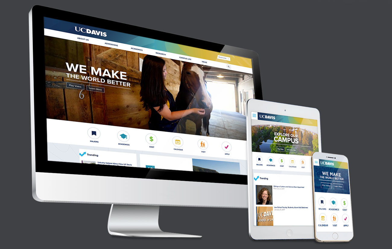
Digital audiences are using every device to access our digital properties, for example, we have data that undergradaute applications are submitted through internet apps on smart TVs. The best way to meet that need is through responsive design. The more complex and text heavy your design becomes the more difficult it will be to translate to mobile (and other) mediums. Yet another advantage of our Big and Simple Design philosophy, it is exceedingly mobile-friendly.